

How many times did you access the internet via your phone today?
Have you browsed Amazon, looked at menus, or tried to order food on your smartphone?
These days, the number of people that answer in the negative to these questions is extremely low. It’s more important than ever to have a website that functions well on mobile devices, but there are right and wrong ways to do it.
Some right ways might even be wrong for you. So let’s dive into how to do it for self storage!
You probably don’t need us to tell you that more people than ever are using the internet on a phone.
But did you know that the number of people using smartphones is quickly overshadowing those using desktop computers?
It’s so prominent that there are some people that only browse the web via their mobile phones. If you take out those that use a desktop computer for work, that ratio probably leans even more in favor of mobile devices.
According to internal StoragePug data, what used to be a nearly 50/50 split between phones and desktops accessing our self storage websites just two years ago is now as much as 12% in favor of phones.
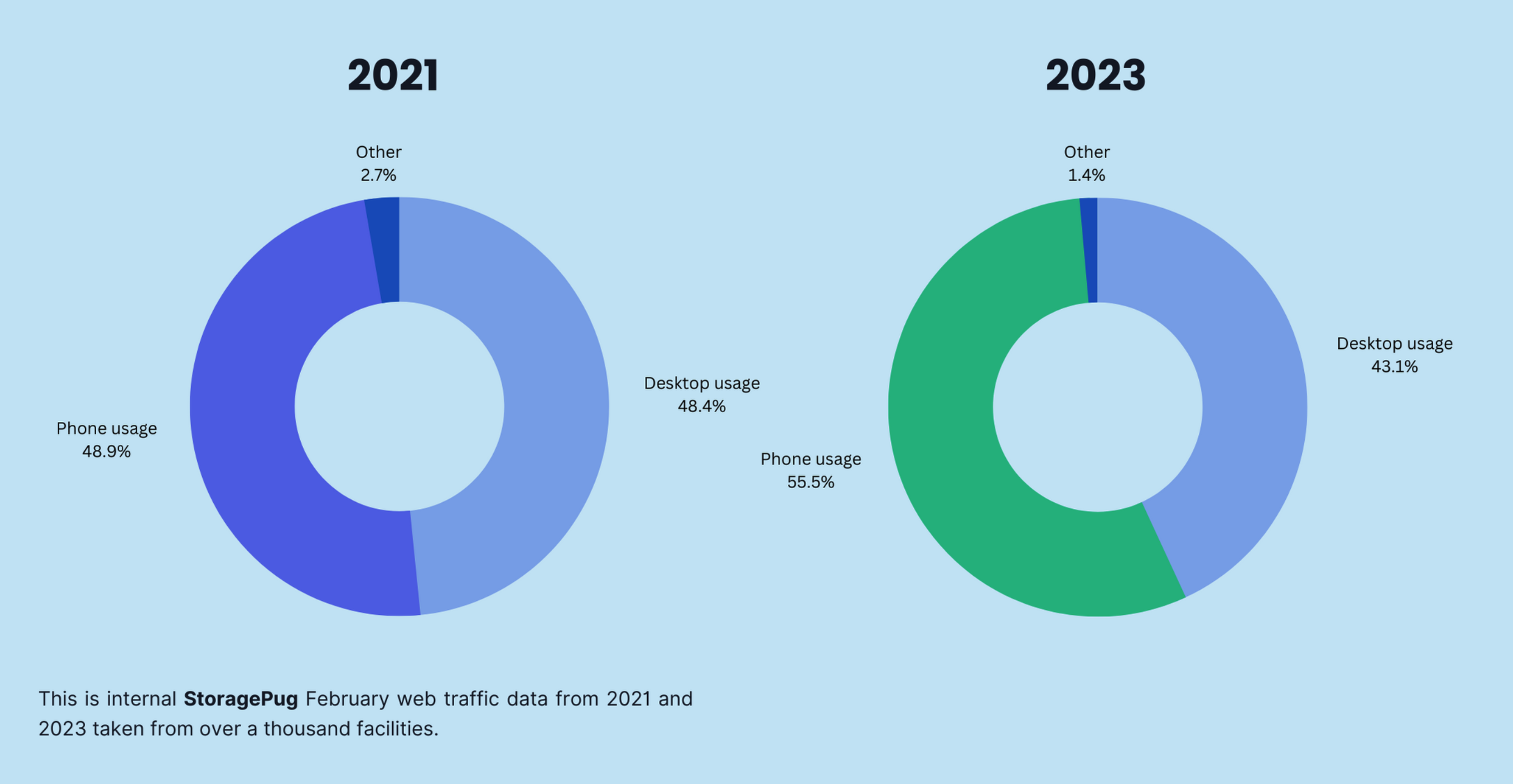
This doesn’t only show that most people are using phones to run storage units; it also means that the trend is growing.
The gap will probably widen even further within a few years.
You might be thinking, “Well, of course, mobile-friendly means you can use it on your phone.”
But what does that really mean? We can navigate to virtually any website on our phones already. So are they all mobile-friendly?
No. A mobile-friendly website is one that is optimized for use on a mobile device. It’s one that looks good and feels good to use while on a smartphone.
Mobile-friendly web design is on a bit of a spectrum. You can be mobile-friendly but not as mobile-friendly as another website, for example. This is because each element on a website can be adjusted to make it work better on mobile.
The more adjusting you do, the more mobile-friendly you are!
Here are some examples of things that can be adjusted to make a self storage website work better on mobile devices:
And there could be even more to add to the list, depending on what your website includes!
There are two main ways you can build a page that is mobile-friendly:
Having two unique pages is the old-school way of mobile-friendly design.
Basically, you have a page designed for mobile and a page designed for desktop. When a user accesses the website, it automatically detects if they’re on mobile or not and sends them to the appropriate page.
Have you ever loaded a website on your phone and seen that the URL in the address bar starts “m.” instead of “www.”? That means the website has different pages for mobile and desktop users.
It’s a model that works well for some kinds of websites and not as well for others.
A responsive design works best for many types of sites—including storage.
While it may be a little bit more work to pull off, a responsive web page design lets you have all of your traffic come through a single page.
With a responsive design, the page changes based on what device is being used. It’s the same page, but it looks different on different screen sizes.
For self storage, a responsive web design is the best choice for a mobile-friendly site.
At StoragePug, we design responsive websites for self storage facilities. We choose a responsive design for a variety of reasons, but one stands above the others: SEO.
If you have two unique pages to handle two types of traffic, this means traffic is being directed through two different pages. That might sound a little redundant, but it’s worth pointing out.
A page that gets lots of traffic with more interactions and time spent on the page is seen as more valuable for Google to show to its users. This also means you’re able to see all of your relevant analytics on a single page instead of having to combine the data from two pages.
Here are some of the things that go into making a response website design:
Image sizes can get really confusing really fast for most people.
There’s the actual size you see, the pixel count, and even the file size. But in this case, we’re most concerned about file size.
When building a responsive website, you need to make the images change based on screen size. If someone is on a desktop computer with a nice big monitor and you display an image sized for a phone screen, the chances are it’ll look either tiny or low quality.
On the other hand, many phones don’t have the same power (or stable connection) that a PC has, so making them load a full-size photo can cause poor load times. It can also cause visual clutter if it takes up too much of the screen space.
Instead, we have the image adapt to the device. A nice, high-definition photo that displays well on desktop is compressed and made to be a much smaller file size that will load quicker on a smartphone.
For the best results, we aim to keep images under 500 KB and videos under 10 MB.
Simply put, element spacing means how much space you have between different components of a web page.
On desktop, you can have a high density of elements. A mouse cursor is very precise.
On mobile devices, using your finger with a touch screen is much less precise than a cursor. You also need room to press and drag in order to scroll (unlike on a desktop computer).
If you use any fancy components that run fairly smoothly on desktop mode, we need to make sure that they aren’t resource hogs when it comes to mobile.
This is similar to the concept of scaling down images. Basically, we make a version that uses fewer resources for mobile users, if possible.
Lazy loading is a simple concept that basically means don’t load certain content until it’s going to be seen.
Imagine you have a big component or lots of images at the bottom of a page. The load time for the whole page goes up if you need to load it all when a user lands on the page.
For self storage customers, there’s a strong possibility that a user won’t ever scroll to the bottom of the page.
The storage units are at the top, so why go any lower?
By using lazy loading, we can cut down on page load times by not forcing your customers to load components they may never see.
To illustrate what responsive web design looks like in practice, here is a StoragePug website.
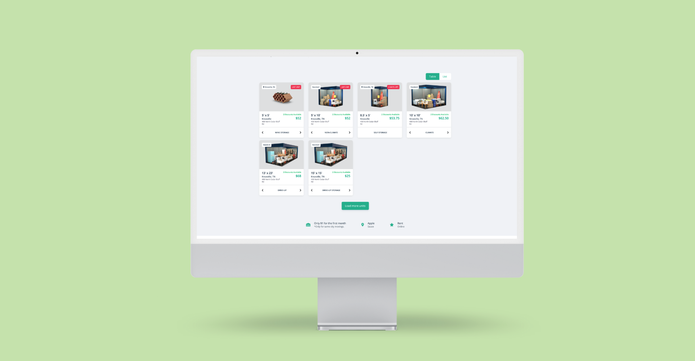
This is what it looks like when a customer visits a StoragePug website and views the units offered at the facility.
Next, let’s take a look at it on mobile.
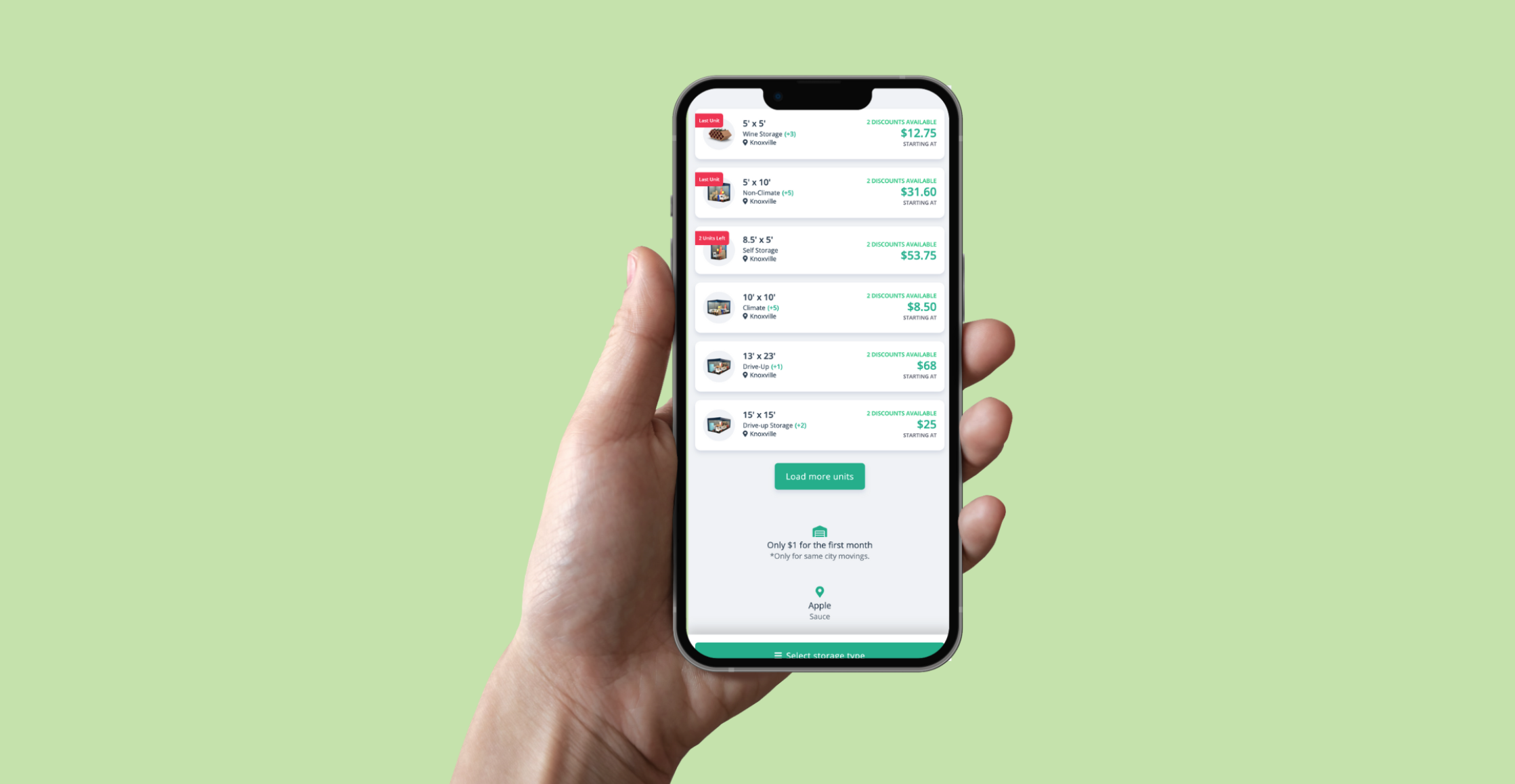
While the units are displayed in a grid with larger images on desktop, you can clearly see how it shifts on mobile devices.
Here, the units are organized as a vertical list with more space given to the text of the listing.
While there are a few ways to make websites mobile-friendly, a responsive design is currently the best route for a self storage facility’s site.
Responsive web design for self storage enables your customers to easily use your website on mobile devices without causing concerns for SEO, usability, or poor load times.
Robert Priester is the Senior Content Writer for StoragePug in Knoxville, TN, where he writes content for self storage websites, informative blog posts about marketing or storage, and ebooks that educate the industry. He has been with StoragePug since 2021. Robert's goal is to help smaller operators understand storage and marketing in new ways and refine the way they do business in order to succeed.